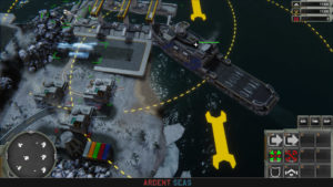
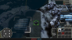
During our internal playtests we’ve found that the readability of the game is lacking, to say the least. Players need a lot of information, and previously, we didn’t display nearly enough of it. So here is how we’re working on fixing that.
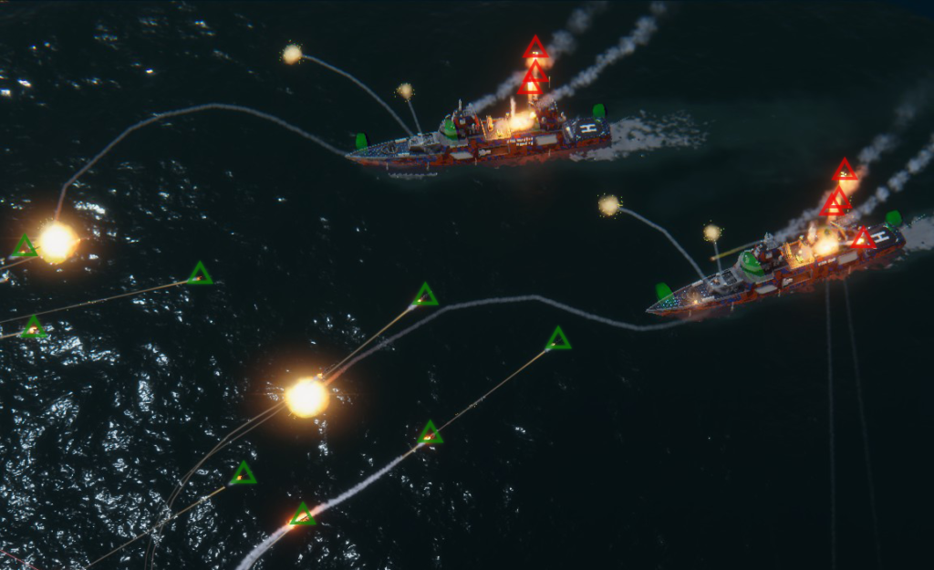
A lot of pretty symbols, essentially! The triangles in the picture above will most likely be on a toggle, or only visible while a missile is in the fog of war, but still in RADAR range. Note: There is a graphical glitch at the moment, with the water interaction bodies, the green blobs on the ships. When a ship was previously in the fog of war, they become visible.
The Missile icons would also mostly likely only appear on “attacking” missiles, not “defending” missiles, like the RAMs seen launched here.
As it is right now, ships have a view range, and that’s it, either an enemy is seen or they aren’t. I want to change that for a more detailed system, that takes sensor ranges into account, meaning RADAR and SONAR. Enemies that are detected by RADAR and SONAR outside of visual range appear as icons representing their size and class, but not what they are exactly. Any small ship would have the same icon, any capital ship, and building, and any vehicle, all would have the icon respective to their class.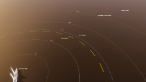
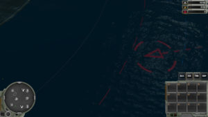
To further improve readability, and these are also toggleable, units get range circles for various properties. Maximum weapons range, CIWS range, view range, radar and sonar range, and a set of range markings for 250, 500, 750, 1000 and 1500 meters. Special areas of effect, such as repair and refueling areas, or the effective range of encapsulated torpedo mines, would all be displayed this way.
With the TDN especially it’s often the case that you need to keep as far out of range as possible, and use your sensors and scouts to the max to win in an even fight against the other two. Conversely, with the Coalition you need to get as close as possible, to bring as many weapons to bear as possible.
Bases and base building have been given some improvements too, as has the UI itself.
It is sometimes a bit difficult to glance what is landscape and what is player owned, and by which player. To make it easier, all buildings now have a bracket that corresponds to their footprint. It changes color based on allegiance. Like the future UI that will be used on units: Green means it’s yours, red means it’s an enemy, yellow means its an ally, and white or gray means it’s unowned/neutral.
Static building slots are now represented by holograms, to clarify that there could be *a thing* there. Seen in the screenshots above are a mining robot, and a port authority building.
For consistency, Stop and Attack Move are always on the same spots in the UI, production options are at the bottom, and special abilities, like loading and unloading units, is placed at the top.
The Unit UI is as much a work in progress as most of the things mentioned here, but we do have concepts and mockups for them as well. We’ve shown those before, but for completeness sake, I’m including them here as well.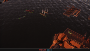
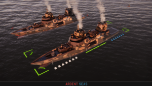
Behold, our (old) stuff! And with that I am signing out for the day. Remember to follow us on Twitter, Facebook, and to wishlist us on Steam!


